Twitch Brand Refresh
Working with legendary design agency, COLLINS, and our internal creative team at Twitch, I developed a motion language to define a recognizable and ownable motion style for our refreshed brand. In addition to the new motion identity, I created a reel (included at the bottom of the page) to help launch the brand into the world.
Logos
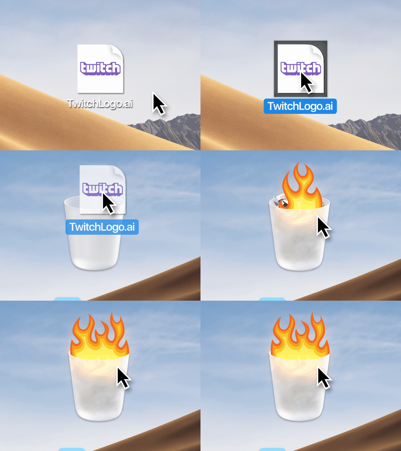
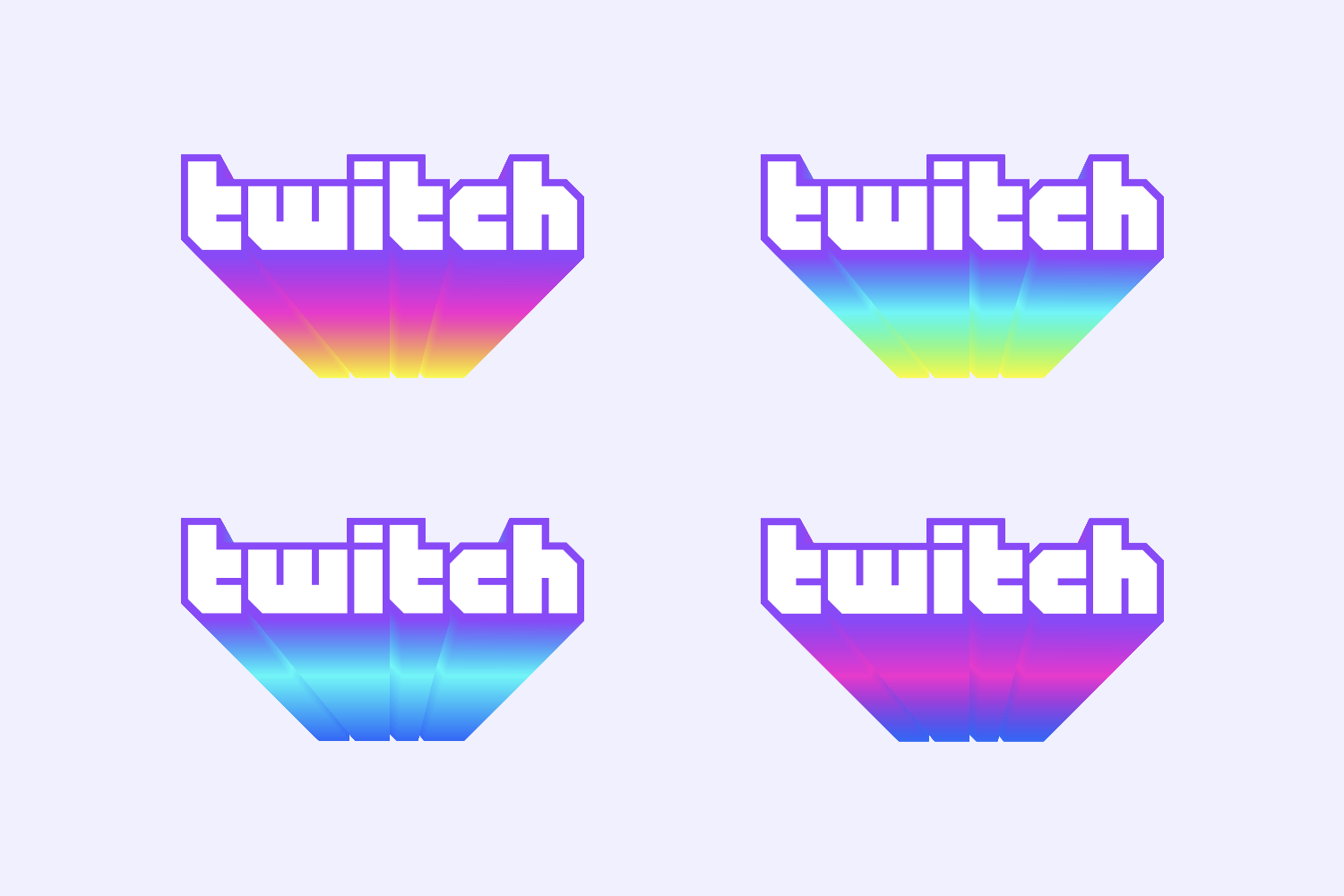
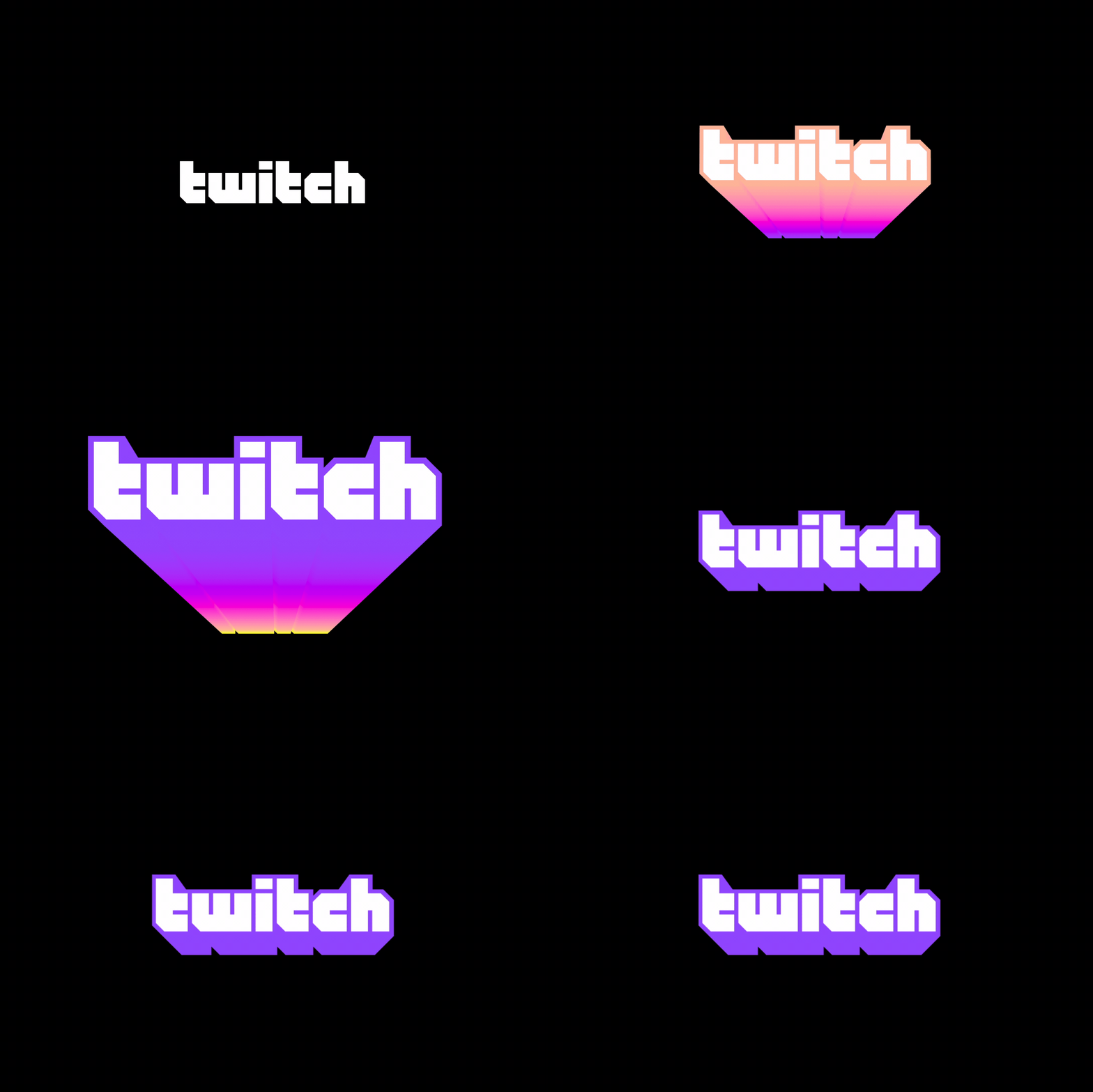
One of the first things developed by COLLINS was a refreshed logo system that incorporates the colors of our creators into the brand. This is done through a new, extruded wordmark and gradient that blends our Twitch purple into the colors of our creators' brands.



Color
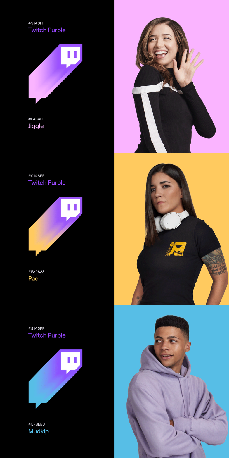
Not to be left out, our brand icon, "Glitch," got the gradient treatment as well. In order to animate the icon extruding through a flexible gradient system, I created a custom Cinema 4D setup that allows us to render Glitch through any number of custom gradient setups.


Wrapping it all up
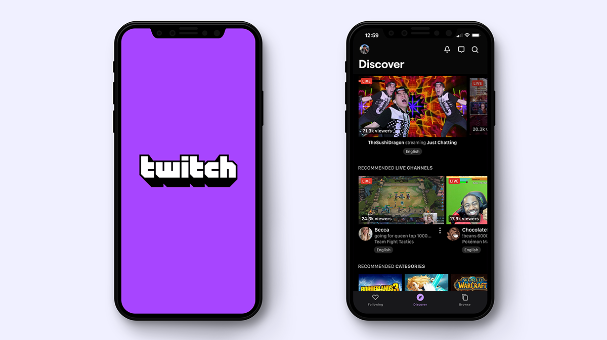
Here are a few more of my favorite pieces from the rebrand. Be sure to check out the brand reel at the bottom of the page.



Credits
Role: Motion Design, Editing
ECD: Byron Rex Phillipson
AD: Sam Johnson
Copy: Evan Freitas
Agency: COLLINS


